


Fashion Magazine Cover Conventions
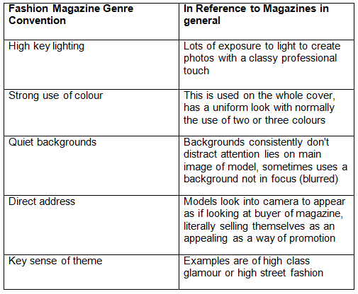
Example of Magazine Cover

In this June 2016 cover featuring singer Selena Gomez, the audience can gauge that the theme is high glamour as she is dressed in expensive attire subtle makeup and stylised hair. Gomez is connecting with the target market with her eyes looking into the camera projecting direct address. There is a strong colour scheme of red and white consisting of predominantly red in the typography of the masthead 'Marie Claire' and caption 'red hot summer style' matching her black and red outfit while the other captions are white in colour. The background is kept plain in order not to distract the readership from the main image of the singer. The photographer of this cover has used high key lighting as the cover issue shows areas of light and faint shadows on Gomez's face, right arm and shoulder. Typical magazine front covers have white females grace their covers, this dominant representation can be an issue to audiences when this is projected as the beauty ideal, provoking many readers to interpret this with a negotiated or oppositional reading instead of the dominant or preferred reading magazines want readers to have.
Magazine Issues

Fashion magazines frequently name their covers with on vartious topics, topics range from fashion related issues such as the big fashion issue by Harper's Bazaar and the ageless style issue by Vogue to non fashion related issues like the math issue and the sisterhood issue by Fashion and Elle respectively.
Typography
Serif and Sans Serif Typefaces
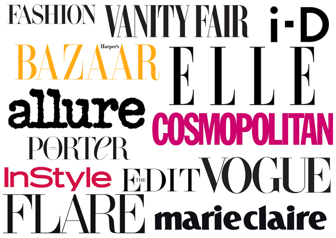
The definition of a typeface is a family of fonts. Serif typefaces utilise small typefaces known as serifs, these typefaces tend to look more traditional than sans serif typefaces that look cleaner and contemporary. Fashion magazines like Vogue, Harper's Bazaar and Vanity Fair use fonts that appear formal projecting the magazine's importance and how they are very established. In recent years, Vanity Fair changed the font of their masthead from their previous typeface to have a more authorative impression.Others such as Cosompolitan, InStyle and i-D use slightly more modern fonts that showcase simplicity and could be a
reflection on the fact that their magazine is easy accessible to their audience. Looking at these fonts used, I have noticed that mastheads for magazines don't tend to look particularly fancy since the magazine's masthead needs to be legible for the readership.
reflection on the fact that their magazine is easy accessible to their audience. Looking at these fonts used, I have noticed that mastheads for magazines don't tend to look particularly fancy since the magazine's masthead needs to be legible for the readership.
Contents Pages


Webpages
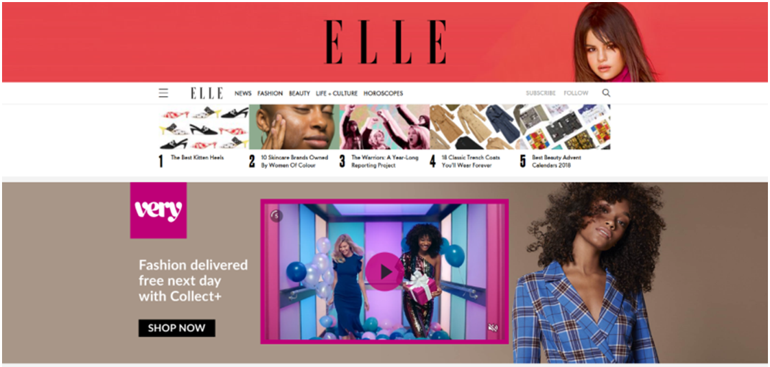
 Elle magazine has a strong sense of brand identity since the
first thing that can be seen on their homepage is their brand name on their banner with an image of Selena Gomez (the face of Elle's October issue) on the right. Their additional
subheadings are: news, fashion, beauty, life+culture and horoscopes, showing
the hierarchy of the topics the magazine covers. An advertising video promoting purchasing of products by Very is relevant to the Elle’s audience of predominantly woman of class AB
who enjoy reading about fashion and fashion related news and culture. The
primary images for the articles at the below the heading and masthead have been
created in a linear format. Scrolling down the homepage, more articles are provided with
larger images in with accompanied article names which are capitalised and subtext.
The articles also include the names of Elle’s writers such as Olivia Lidbury. Articles cover a range of genres such as fashion, beauty and culture for example Japanese culture in the one of the articles above. Another advert has been alongside another advert for perfume, Les Parfums by Louis Vuitton.
Elle magazine has a strong sense of brand identity since the
first thing that can be seen on their homepage is their brand name on their banner with an image of Selena Gomez (the face of Elle's October issue) on the right. Their additional
subheadings are: news, fashion, beauty, life+culture and horoscopes, showing
the hierarchy of the topics the magazine covers. An advertising video promoting purchasing of products by Very is relevant to the Elle’s audience of predominantly woman of class AB
who enjoy reading about fashion and fashion related news and culture. The
primary images for the articles at the below the heading and masthead have been
created in a linear format. Scrolling down the homepage, more articles are provided with
larger images in with accompanied article names which are capitalised and subtext.
The articles also include the names of Elle’s writers such as Olivia Lidbury. Articles cover a range of genres such as fashion, beauty and culture for example Japanese culture in the one of the articles above. Another advert has been alongside another advert for perfume, Les Parfums by Louis Vuitton.
Social media links such as Facebook and Twitter are easily accessible to enter Elle's social social media pages and encourages their readers to comment, like and share.
No comments:
Post a Comment