Dear Moderator,
If you look at the labels on the right hand side you will find my research under 'AS Research and Planning'. I hope you enjoy viewing my coursework.
Cherish Okereke
This blog is now closed.
My Website

Please click here to view my website
Front Cover Edition 1

Contents Page Edition1

Front Cover Edition 2

Contents Page Edition 2

Wednesday, 28 March 2018
12. My Final Production
Here lies my final adverts I have produced:
Advert 1

Advert 2

Advert 3

Advert 4

11. Production Review: My production and my intended improvements
Production Review: My production and my intended improvements
To help me improve my adverts I had my teachers go through each individually to tell me what I needed to improve upon. I have noted the things I needed to improve upon and I have rectified the problem areas which can be seen resolved in my final adverts which are completed.

10. My Planning Evidence
My Planning Evidence
Below is the table I utilised for planning, it really helped me organise myself and models so I could work efficiently and properly.


Location Report
I have photographed the locations of my adverts and I have included my reasoning as to why the two locations were suitable.

9. The Practicalities of Photographing: when and where production will take place and who with
The Practicalities of Photographing: when and where production will take place and who with
As part of my planning, I thought it would be more straightforward and easier to organise in a table, when I confirmed more agendas I will update this table.

With each location I have looked at the risks of filming in particulars areas. I have decided to film in the media department for photoshoots and the wall of a school building as a another background, this is because they are both safe for the models and myself and additionally will not affect the shooting kit such as the camera and lighting equipment.
8. The planning I intend to complete in order to ensure a successful outcome for my production
In order to be efficient with shooting the shots for my print adverts, I have to make list of what has to be organised beforehand. The list of the following is what I plan on arranging:

I think it is essential to know what to bring on the day since it will mean I will be able to proceed through shooting better and my models will also be able to be organised as well.
6. The ASA: Rules in Print Advertising
For my reasearch, I have found who the ASA are and have also about the rules set for print advertising. Since then, I have looked at adverts that have conformed to their rules and those that have not. This has all aided my understanding on what is is and is not acceptable in print advertisements.
The ASA
The Advertising Standards Authority (ASA) is the self-regulatory organisation operating in the UK. Founded in 1962, it is a non-statutory organisation organisation which means it is unable to 'interpret and enforce legislation'. The Advertising Codes are applied by the organisation of the codes have been written by the Committees of Advertising Practice (CAP).
ASA Rules related to Print Advertising
In this section, I have outlined some of the rules from different sections which apply to print advertising
Compliance
1.1: The print ad should showcase the truth and be legal
Recognition of Marketing Communications
2.1: The advert should be 'obviously identifiable' as one
Harm and Offence
4.1: Adverts must take care not to cause 'widespread offence', it should aim not to offend any; age, disability, gender, race, religion or sexual orientation. The ad should not be seen as unpleasant, offending the public
4.2: The print advert should not give anyone distress or fear without a purpose that is justified and should not be excessive. No scandalous claims should included and images there to capture attention with no other reason should be excluded
4.8: Under 18's and those who seem to be under 18 in an advertisement must not be displayed in a sexual manner
Advert Banned by the ASA
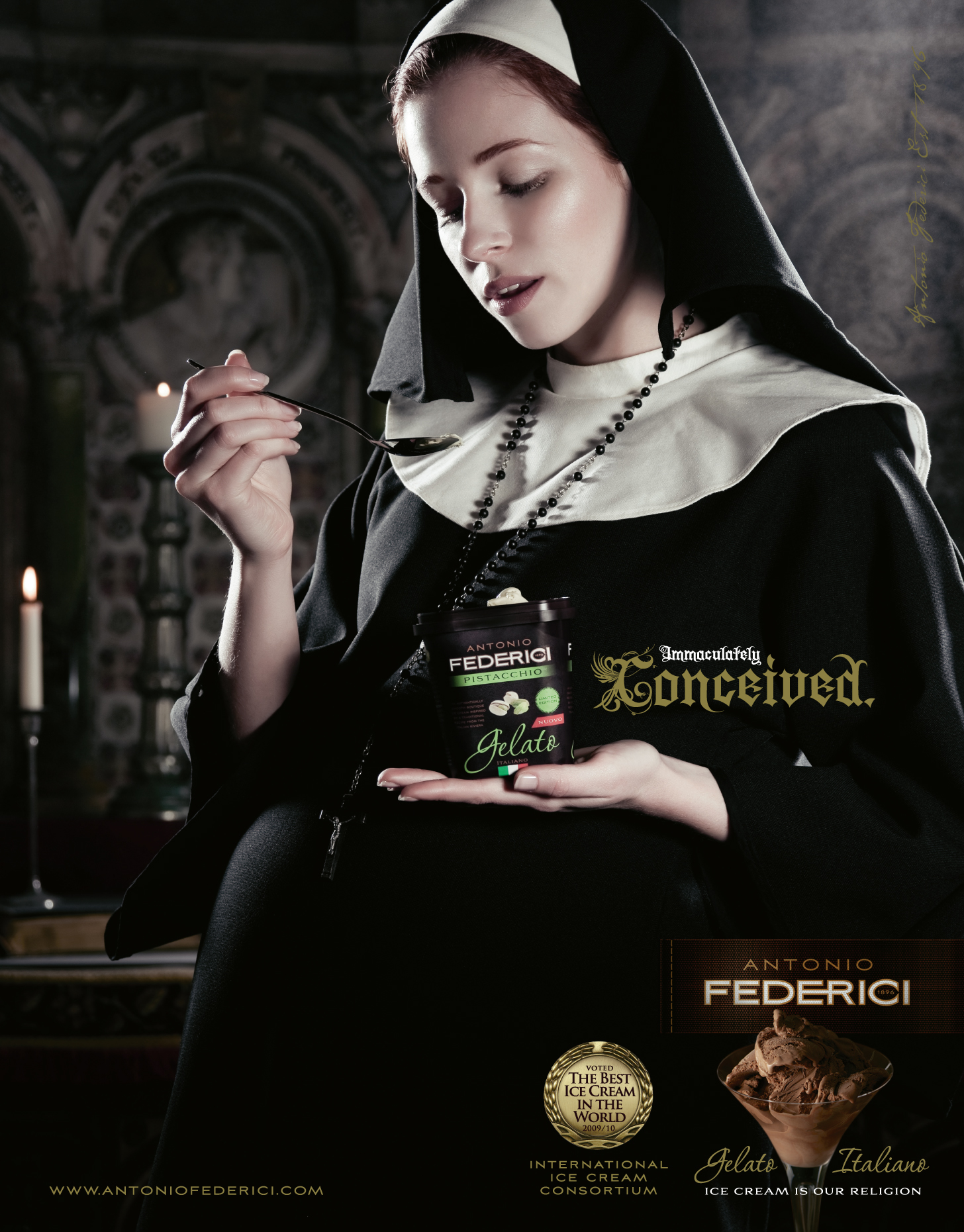
-Displayed around Westminister Abbey just before the Pope's visit to London
-The ad mocks the religion of Christianity and Christians and Roman Catholics alike, this means it causes widespread offence to people of religion mentioned above
-Tries to come across as light-hearted with the phrase; 'ice cream is our religion' but is deeply offensive -After only receiving a few complaints, the ASA banned this Anthony Federici ad, the company also confessed to attacking religion
Advert Accepted by the ASA

-Shows the passing of a package from the USA to Brazil
-It is very inventive and its idea is unique
-The natural colour background is artistic and realistic at the same time, the window shutter blend in well and for this colour scheme -This FedEx ad does not offend anyone and its demographic is everyone around the world, this is projected through the obvious hint indicated in the ad
-The photo is not excessive and does not include copy such as strapline that could be insulting
What I have learnt about the ASA rules in relation to television, print or radio advertising and how I intend to use this knowledge and understanding, to ensure my production is appropriate to the media industry context of the set brief I have chosen
As a result of my research, I now have a firm idea on what is appropriate in this form of advertising and what is not. I will to be inventive with my ideas without offending any particular audience in the process. My print ads will feature aesthetically pleasing images without being there just for the purpose of attracting an audience. I will include honesty within my ads without disclosing things are not proven to be true.
Total Film
Total Film is a British magazine which produces 13 issues a year, new issues are published every month in addition to a summer issue. Its first issue came out in February 1997. The price of each magazine is £3.99. The magazine provides its readers with: reviews, features on big new releases, news on industry and upcoming films, DVD reviews, games as well as the culture surrounding film.
Since my target audience are people who read Total Film magazine, I have done some research into its audience:
Total Film's audience are avid viewers of film and are aged between 18-35, their average reader is 26 years old. The magazine has a predominantly male readership of 75% and the average income of a reader of this magazine is £34,532. They are interested in Hollywood films, new releases (52% frequently watch new movie releases) and are willing to share their knowledge on film.
The content the magazine typically provides are news and reviews, to make sure my adverts are appropriate to this target audience I will include a memorable quote from different films.
-Here an example of a Total Film Magazine cover, it is Total Film February 2018 Issue 268. The cover is relevant to film goers featuring the new Hollywood release of Black Panther and also mentions other films such The Shape Of Water.
 |
| Example |
5. The Representation of Events, Individuals, Issues and Social Groups in Print Advertising
For my brief, my specific target audience are of ages 16-25 aimed at both genders. I have explored adverts representing diversity in ethnicity, feature both genders and youth.
I looked at two print adverts below, focusing on its representation of events, individuals, issues and social groups.


What I have learnt about the representation of events, issues, individuals and social groups in television, radio or print adverts and how I intend to demonstrate this knowledge and understanding in my production in order to communicate meaning successfully
I looked at two print adverts below, focusing on its representation of events, individuals, issues and social groups.
#WeCanAll Campaign by American Eagle

-Features a variety of people of various ethnicities and genders
-Advert is set in the outdoors
-Models are fully clothed, not dressed
provocatively
-Everyone together shows a united front but the models are still individuals through the clothes being different
-The group are a selection of youthful people who are happy, enjoying themselves, there is no violence or negativity associated with the group
-Strapline: 'we the people' projects them as a collective who are stronger together
-Strapline: 'we the people' projects them as a collective who are stronger together
Men Vs Women Challenge Campaign by Nike
-This Nike advert has tied in the topic of the
battle of the sexes
-It represents women in a positive way, it does not objectify them and show they are equally strong and competitive
-Links in the theme of love with strapline; 'love can wait'
-Both models are teamed with equally serious expressions who are up for the challenge of dominating the sport of running
What I have learnt about the representation of events, issues, individuals and social groups in television, radio or print adverts and how I intend to demonstrate this knowledge and understanding in my production in order to communicate meaning successfully
I have learnt that for adverts can convey men and women together as one.In some adverts, women can be presented covered without revealing skin. Positivity is spread throughout different advert for example with the bringing together of people of different racial backgrounds. Moving forward, I would like to in my advert include togetherness as I think it really works well and it displays diversity and will help connect a variety of people to my advertisement.
4. The Content and Appeal of Print Adverts
For my research into the content and appeal of print adverts, I first explored the uses and gratification theory.
The Uses and Gratifications theory was produced by Jay Bulmer and Elihu Katz. It indicates that users of the media play a significant role in selecting and utilising the media. The pair
(Bulmer and Katz) thought that the media user would choose the source of media that would best suits their needs.
The assumption is that the audience would choose want they want to view based on four various reasons: entertainment and escapism, information and education, integration and social interaction and lastly, personal identity.
Entertainment and Escapism:
Watchers see particular shows for enjoyment purposes and viewers are able to imagine and leave their real lives behind being immersed in their media activity
Information and Education:
Audience seek valuable knowledge and educate themselves using programs such documentaries or the news
Integration and Social Interaction:
Media products can cause people to converse about them i.e. The X Factor, Britain's Got Talent
Personal identity:
Watchers are able to relate to a product or person in a specific aspect that mirrors their characteristics or values
For my focus on examples on adverts, I have looked at film posters since my print adverts are targeted at an audience of film enthusiasts of Total Film magazine. I have picked posters of films that target the 16-25 audience and I aimed to looked at a film that is for amusement in addition to one which is partially informative.


-Close up shot of one of the main actor's face (Sandara Bullock) communicates the concept of terror within the film
As my target audience readers of Total Film magazine, I will make sure to include bold colours that match the rest of my posters and furthermore intriguing backgrounds. My aim is for my adverts to be informative as well as having some elements of escapism and relatability. If I could add a slice of comedy, I would be happy as it would catch the target audience's eyes and entertain them.
The Uses and Gratifications theory was produced by Jay Bulmer and Elihu Katz. It indicates that users of the media play a significant role in selecting and utilising the media. The pair
(Bulmer and Katz) thought that the media user would choose the source of media that would best suits their needs.
The assumption is that the audience would choose want they want to view based on four various reasons: entertainment and escapism, information and education, integration and social interaction and lastly, personal identity.
Entertainment and Escapism:
Watchers see particular shows for enjoyment purposes and viewers are able to imagine and leave their real lives behind being immersed in their media activity
Information and Education:
Audience seek valuable knowledge and educate themselves using programs such documentaries or the news
Integration and Social Interaction:
Media products can cause people to converse about them i.e. The X Factor, Britain's Got Talent
Personal identity:
Watchers are able to relate to a product or person in a specific aspect that mirrors their characteristics or values
For my focus on examples on adverts, I have looked at film posters since my print adverts are targeted at an audience of film enthusiasts of Total Film magazine. I have picked posters of films that target the 16-25 audience and I aimed to looked at a film that is for amusement in addition to one which is partially informative.
The Proposal

-This film has been produced solely for entertainment
purposes, it strikes up laughter with its comedy
-Can be seen as recognisable in terms of situations
within its more or less everyday setting
-Opposes the traditional stereotype of men proposing
to women
-Audiences can relate to the antics in this film, the film
can be used as a topic of conversation helping
people interact with one another
-There is only a slight bit of escapism due to the fact it
is set in normal surroundings and time period
-It has no intentions to educate its watchers
Gravity
-This type of film is source of escapism for the viewer, sets the watcher's imagination in space
-Made for entertainment purposes which can thrill its audience
-Can educate the viewer on space given them a better understanding on the affect of gravity in space, for those who enjoy gaining knowledge in science or in general fascinated by space
-Theme of being lost and stranded lies in film, the audience can identify with this if they can recur a time of feeling like this or something along these lines-Close up shot of one of the main actor's face (Sandara Bullock) communicates the concept of terror within the film
What I have learnt about the content and appeal of television, radio or print adverts and how I intend to demonstrate this knowledge and understanding in my production in order to communicate successfully with the target audience
3. The Codes and Conventions of Print Adverts
What I have learnt about the codes and conventions of television, radio or print adverts
I looked at different deodorant adverts made for print and compared advertisements made for the female audience to others made for the male audience. I tried to looked at a variety of the most popular brands. For each company I have used an example for each brands's print adverts to analyse. For each advert I looked for the list of the following categories:
-Is there a male or female model
-Whether the model is a known face
-If the main photo is centralised
-Whether the slogan is featured
-If the ad gives a fact/statistic
-If there are bright colours/a colour scheme
-If the product is show in a bottom corner or not
-Background
-Lighting
-Is there context given on product
For the female audience:
Lynx
-Male and female model in the centre both showing side profiles, they are not known faces -Slogan is present in ad: 'unleash the chaos' -Background features a city's skyline -There is no context and no fact/statistic -Colour scheme is red and blue -The lighting is bright -The product has been unconventionally placed in the top right corner, could be to reflect their slogan (unleash the chaos)
-Ad projects instant love with both genders present in advert facing one another
-Use of attraction conveys desire connoting the deodorant creates this encouraging its target audience to buy into the products
Dove
For the male audience:
Lynx
Dove
Sure
-Advert include a male and female model, they are unknown and in the centre, arms raised
-The slogan: 'it starts with you' is positioned in the left top corner of the ad
-There is context, stating the product delivers 'triple protection against sweat, bacteria and body odour', this can also be considered a fact
-Colour scheme is dominated by shades of blue with smaller amounts of white
-In the background there is a crowd and flags hang above the models's heads
-The foreground is brightly lit but there is dull lighting in the background
-The deodorant is visible in the right hand corner
-The ad displays the deodorant as a product that allows the consumer to feel free when wearing it, it allows them to be themselves, providing them the confidence it gives
Print adverts that are targeted at women, usually feature female models who are unknown by the public eye, this works the same for adverts targeted at men although the models used can be of both genders. Generally the product being advertised is located in the right hand corner at the bottom but this does not always have to be the case. Sometimes the advert includes context but normally the ad mentions what the product does giving a fact or some sort.
-Whether the model is a known face
-If the main photo is centralised
-Whether the slogan is featured
-If the ad gives a fact/statistic
-If there are bright colours/a colour scheme
-If the product is show in a bottom corner or not
 |
| (Example) |
 |
| (Example) |
-Dominant picture of female models
-Main photo lies in centre
-The picture of the product lies in a bottom corner (bottom right)
-There has been no use of celebrities
-Includes fact: 'sleeveless-ready in just 7 days'
-Plain white background
-Colour scheme is white
-No slogan attached
-Bright lighting
-Extra information is at bottom of page
-Feel good has been presented with the bond of women reflecting female empowerment, signifies a closer relationship/friendship of women together all glowing with confidence
-Extra information is at bottom of page
-Feel good has been presented with the bond of women reflecting female empowerment, signifies a closer relationship/friendship of women together all glowing with confidence
Sure
 |
| (Example) |
-Unknown female model slightly off-centre
-Slightly blurred background of a studio
-Greyscale colour scheme
-Slogan has not been inserted
-2x protection (48 hour), fact provided
-Dull lighting with lots of shadows produced
-Product is placed in the conventional right hand corner
-Information on product is written in a small font on the left hand side
-This ad conveys sweat as something strong women do and they should not feel ashamed for that
-The deodorant gives the consumer (a female) the power to feel comfortable and do what they need to do
-The deodorant gives the consumer (a female) the power to feel comfortable and do what they need to do
Nivea
 |
| (Example) |
-Features both a male and female model
-Models shown are unknown
-The focus of the picture is in the middle
-Displays a fact: 'no more deodorant stains'
-Includes slogan: 'feel closer'
-Lighting is bright with some shadows cast
-Products are presented in the bottom
right hand corner
right hand corner
-Backgrounds features a crowd behind the models
-More information on product given below main focus
-Deodorant promotes no visibility of stains as a result of a combination of sweat and deodorant boosting the wearer's confidence completely
-More information on product given below main focus
-Deodorant promotes no visibility of stains as a result of a combination of sweat and deodorant boosting the wearer's confidence completely
 |
| (Example) |
-Female model has been used as the main focus, in the centre
-Model is not known
-Background shows a window and chest of drawers (home-like environment)
-Lighting is not very bright, path of light can be see coming from top left hand corner and light is emitted from halo
-No context or fact/statistic given on product
-Colour scheme is a combination of purple and cream to beige, the colours are not bright
-Slogan is included in ad: 'even angels will fall'
-Product is shown in the right hand corner
-There has been a use of sex appeal in the advertising for men's deodorant using a female model, the model's facing expression is sultry generating the idea of fun activities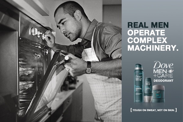 |
| (Example) |
-Male model present, attention lies on him as he in the centre
-The model is not someone in the public eye
-Slogan is written in the bottom in the right hand corner: 'tough on sweat, not on skin'
-No context is given on product, neither is there a fact nor statistic
-Greyscale colour scheme has been employed
-Deodorant is featured in the traditional position
-Set in a home environment
-Simple lighting has been utilised
-The ad has been both stereotypical and unconventional towards men's behaviours, it can be insinuated that real men are able to mend and work machinery, but the ad also includes the male model wearing an apron indicating real mean can also cook
-The ad has been both stereotypical and unconventional towards men's behaviours, it can be insinuated that real men are able to mend and work machinery, but the ad also includes the male model wearing an apron indicating real mean can also cook
 |
| (Example) |
-Features three known male footballers: Eden Hazard, Ross Barkley and Fraser Forster respectively left to right
-The main photo is centralised
-Slogan is displayed across the advert: 'Sure won't let you down'
-There is no fact or statistic within a context
-There is no fact or statistic within a context
-The product is in the bottom right hand corner of the ad
-The background shows a football pitch with a stadium/arena, it is not in focus
-Colour scheme consists of hues of blue and grey
-The lighting is bright but soft
-The brand has used the fact many men enjoy the sport of football (the typical man's sport in the UK) either watching, playing or both, coaxing fans of the sport and men alike to buy into the brand
-The brand has used the fact many men enjoy the sport of football (the typical man's sport in the UK) either watching, playing or both, coaxing fans of the sport and men alike to buy into the brand
Nivea
 |
| (Example) |
-The slogan: 'it starts with you' is positioned in the left top corner of the ad
-There is context, stating the product delivers 'triple protection against sweat, bacteria and body odour', this can also be considered a fact
-Colour scheme is dominated by shades of blue with smaller amounts of white
-In the background there is a crowd and flags hang above the models's heads
-The foreground is brightly lit but there is dull lighting in the background
-The deodorant is visible in the right hand corner
-The ad displays the deodorant as a product that allows the consumer to feel free when wearing it, it allows them to be themselves, providing them the confidence it gives
Print adverts that are targeted at women, usually feature female models who are unknown by the public eye, this works the same for adverts targeted at men although the models used can be of both genders. Generally the product being advertised is located in the right hand corner at the bottom but this does not always have to be the case. Sometimes the advert includes context but normally the ad mentions what the product does giving a fact or some sort.
How I intend to demonstrate this knowledge and understanding in my production in order to communicate successfully with the target audience.
As a result of learning the codes and conventions of print adverts, I will now display some of the conventions in my own print advertisement. I will conventionally position my product in the right hand corner and include a fact about my product. Since the product is being advertised for both men and women, I will use at least one model of each gender. I will not use a celebrity because adverts for deodorants do not use known faces.
As a result of learning the codes and conventions of print adverts, I will now display some of the conventions in my own print advertisement. I will conventionally position my product in the right hand corner and include a fact about my product. Since the product is being advertised for both men and women, I will use at least one model of each gender. I will not use a celebrity because adverts for deodorants do not use known faces.
Subscribe to:
Posts (Atom)