Dear Moderator,
If you look at the labels on the right hand side you will find my research under 'A LEVEL NEA RESEARCHING AND PLANNING'. I hope you enjoy viewing my coursework.
Cherish Okereke
This blog is now closed.
My Website

Please click here to view my website
Front Cover Edition 1

Contents Page Edition1

Front Cover Edition 2

Contents Page Edition 2

Monday, 5 November 2018
POST 10: REFLECTIONS ON FINISHED OUTCOMES/TARGET AUDIENCE RESPONSES
The final products have been successful, I have included two social groups with at least two original images on my cover and contents pages and a minimum of four original images across my website. The feedback I have got has been positive and the cover price has been said to be relatively suitable for my target audience. I have managed to fulfil my intentions as I think all my content looks quite realistic and I have been digital convergent across all my content, the print media has the website on it, the website has the social media platforms linked at showcases the print media and the social media links to the website. There is a lot interactivity and a chance to engage in current movements such as #Metoo and Black Lives Matter.

POST 9: 2ND WEBPAGE
Linked Webpage

 Above is the plan of my linked webpage.The brand name will remain a feature on this second webpage portraying consistent brand identity of the fashion magazine. An advert will also be positioned at the top of the page below the banner and the article has a layout as an active slideshow of images and copy. The props I will use will consist of shoes for my articles and links to where to buy them, for this layout and article style, my main inspiration for this layout was Elle's own layout and style pictured above on little black dresses and a Chanel advert on the right of the article.
 For the shots of the shoes, I took all photos in one day.
Here is the finished product:


To improve this web page, my teacher recommended to me to include additional text and alter my language by using more direct address to engage my readers better.
POST 8: WEBSITE HOMEPAGE
Website Homepage

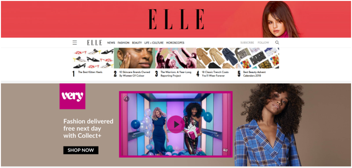
 The webpage will feature four articles and their writers with four images for the articles above. An audio-visual advertisement will be situated at the top of the page and the magazine's logo will have dominance at the top of the page on a banner alongside its search tool linked topics. My inspiration for this has been driven from Elle's homepage. For lower down the homepage, I will replicate the Harper's Bazaar layout of titles of articles along with their authors and captions next to the primary image with a relevant brand advert sectioned in between articles.
To be interactive, there will be social media links to Instagram and Twitter for readers of my magazine to follow, comment, share and like. I will also utilise a subscription button so readers can subscribe to the magazine. The props I will use are mainly clothing and makeup in addition to two models and a background. For one model, she will have wavy hair and red eyeshadow and eyeliner while the second model will have light pink eyeshadow and winged black eyeliner.
Below is the shoot schedule for the website homepage:

Here is the finished product:


For my Fashion page, my teacher proposed that I should include images and articles on it so I put articles onto the page as well as adverts.
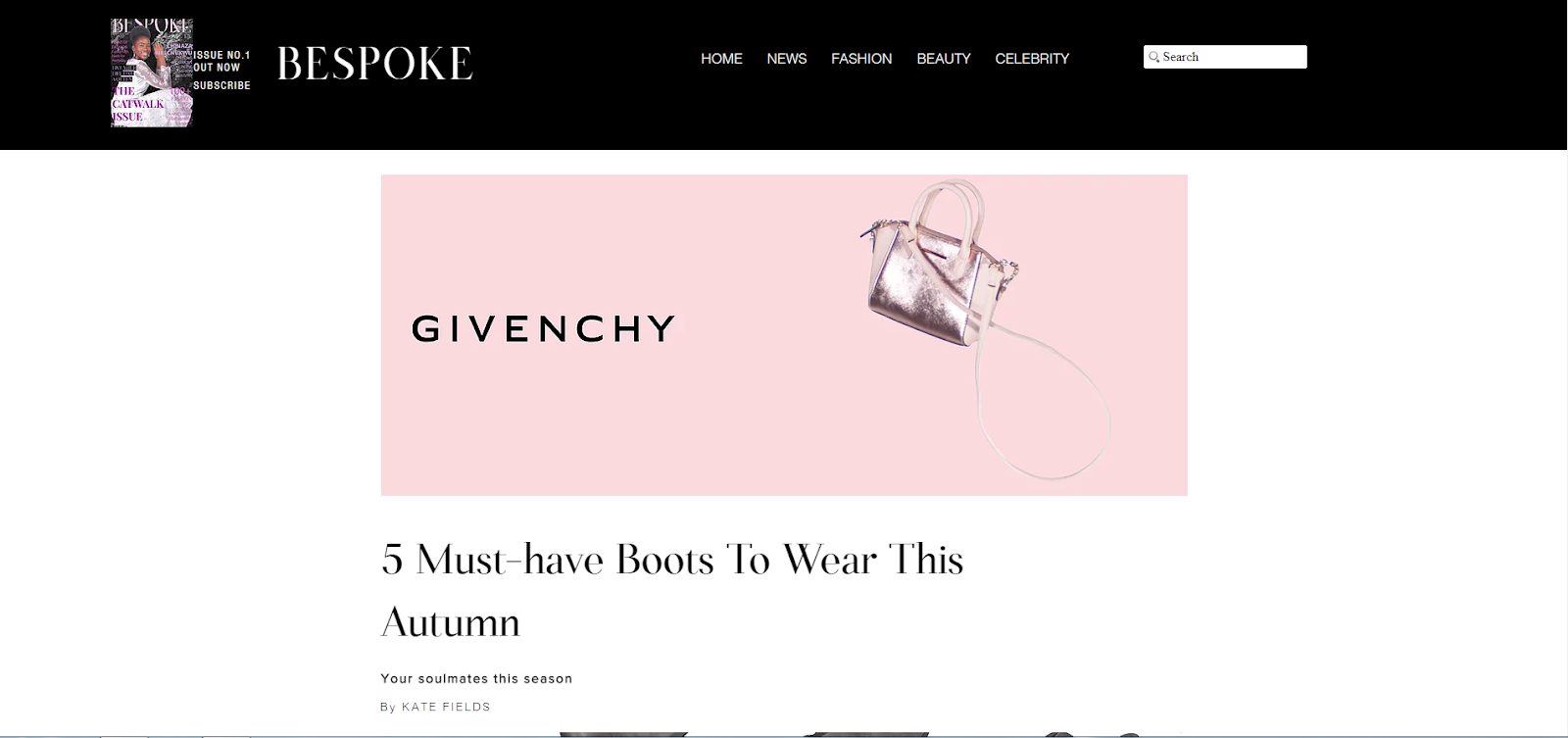
POST 7: MAGAZINE EDITION 2: COVER AND CONTENTS PAGE
Edition 2 Cover and Contents Page


For my second cover I will use a traditional long shot where the model is standing. To follow house style, the masthead will be located at the top centre of the cover in capitals. For readers to be able to access online content, I included the website on the bottom left corner. For both my cover and contents page, I will use the same model but also an additional model for my contents page for representation of two social groups. The female model's hair will be wavy and left out, for the cover her makeup will be dark pink eyeshadow paired with winged black eyeliner and for my contents page, she will have the same eyeliner but dark green eyeshadow. For the background, I will use a colour block as I have seen numerous magazine covers with this.
Below is the shoot schedule for my magazine'subscription front cover and contents page of the second edition:

Here is the final product:


Again, my teacher put forward that I should add my tagline to this front cover so I did so and I tailored my language to appear more engaging for my audience as my teacher also advised.
Sunday, 4 November 2018
POST 6: MAGAZINE EDITION 1: COVER AND CONTENTS PAGE
Edition 1 Cover


The model will be under high key lighting and shots will be taken in a studio. I have chosen to use a floral background for the cover. The makeup will be subtle with pink eyeshadow and black winged eyeliner to portray a soft look.
Below is the shoot schedule for this edition's front cover and contents page:

Here is the final product:


At first I did not include my tagline because it is not conventional to place a tagline on a front cover but along the spine but my teacher suggested I should so I placed on the left below my title. For contents page I was encouraged to slightly alter some listed articles to make more appealing to my target audience.
POST 5: PROPOSAL/RESPONSE TO BRIEF
I have decided to name my magazine Bespoke and its tagline is 'born to be different'. My magazine is predominantly aimed at women between 16-25 of class AB with a view to embrace and not exclude minorities and have diversity in terms of ethnicity, disability and age, it is a magazine promoting freedom of self expression, female empowerment and feminism. The content is mostly fashion related but other genres include beauty and lifestyle as well as celebrities and news.
Print
In print, the title Bespoke, will lie in the centre of the cover in bold and capitalised, the issue number will lie in the top left corner and my tagline will be directly below the masthead, on the left. Typically one female model is placed on a single fashion issue so I will implement these conventions. I intend to make sure to also use at least two different social groups and a minimum of four original images over my covers and contents pages. For convergence, the website of the magazine will be featured in the bottom left corner of the front cover below the barcode. The month of the issue and cover price will be located on the right below the masthead as well. To retain house style, I will apply the same layout across both covers and both contents pages and use the same fonts.


Website

Firstly, I would include the title of may magazine, Bespoke, to the top left corner like Grazia and add a search tool buttons at the top of each web page saying 'news', 'fashion' and 'beauty' for example. For my website I will take inspiration from Elle with an audio-visual advertisement banner and stylise my website in a similar form to the fashion magazine's website, I will opt to use a black banner inspired by Grazia while the rest of the web pages will remain white. Additional influences for my homepage and its layout include Harper's Bazaar. My second web page will be inspired by Elle's 'The Best Little Black Dresses To Buy Now' article as it features a gallery slideshow of dresses and their links to buy them, i would like to implement the same to my second web page but with an article on shoes. all my links will be active, taking my website users to another page. To get to my magazine's social media (Twitter an Instagram) from my website, I will utilise their respective icons.
The values and attitudes my magazine hold will feature across all its platforms: print media, website and social media.

The name of my independent production company is Compass Point Studios, I decided on this name because it promotes its audience to follow what they love such as fashion. For my logo, I used four triangles to represent four points on a compass and I used a monochrome style communicating classic simplicity.
Subscribe to:
Posts (Atom)